AP 104 Grievance Dashboard
A state-wide complaint tracking and SLA management dashboard for the Government of Andhra Pradesh.
ROLE
Lead UX Consultant
DURATION
8 months
TEAM
2 Designers, 10 Engineers
PLATFORM
Web Application & Mobile Dashboard
OWNERSHIP & SCOPE
Requirements Gathering with Government Officials · Information Architecture & Escalation Mapping · Wireframing & UI Design · Multilingual UI Considerations · Handoff via Zeplin
DESIGN STACK
THE PROBLEM
Government officials lacked visibility into departmental performance. Grievances were falling through the cracks due to a lack of automated SLA tracking and escalation matrices.
MY ROLE & CONTRIBUTION
An robust, multi-tiered dashboard that allows officials at district, mandal, and state levels to track, escalate, and resolve citizen issues.
Designing a system that accommodates varying levels of tech-literacy among government employees while handling massive volumes of data securely.
TARGET USER
Monitor / Executive — Reviews dashboard every morning. Prefers charts and maps over tables.
CORE FRICTION
Low digital literacy among ground-level officers Complex hierarchical escalation matrices (Village -> Mandal -> District -> State)
BUSINESS DRIVER
The "104" helpline receives thousands of health and civic grievances daily. The existing manual tracking system was failing, resulting in unresolved complaints and lack of accountability.
KEY CONSTRAINTS
Low digital literacy among ground-level officers
Complex hierarchical escalation matrices (Village -> Mandal -> District -> State)
Need for multilingual support (Telugu & English)
Evidence & Insights
Approach: Field visits to call centers and district offices. Interviews with 10 officers across different hierarchy levels. Held workshops with District Collectors and Call Center Operators to map the lifecycle of a complaint.
USER INSIGHT
Officers prioritize work strictly based on the "escalation risk" (e.g., complaints approaching the Red zone).
DESIGN IMPLICATION
Use color-coded SLA indicators (Green, Yellow, Red) for instant status recognition.
USER INSIGHT
Mobile access is critical for field officers verifying complaints on the ground.
DESIGN IMPLICATION
Implement map-based geographical data visualization.
USER INSIGHT
Reports need to be easily printable for physical filing.
DESIGN IMPLICATION
Simplify the UI for data-entry operators.
Core Architecture & Trade-Offs
Every major interface decision was evaluated against real enterprise constraints, user cognitive load, and accessibility standards.
DECISION 01
If ticket untouched for 48 hours -> Auto-escalate to next level -> Highlight in Red on dashboard.
Designed in Adobe XD, focusing on clarity, minimal cognitive load, and highly visible action items.
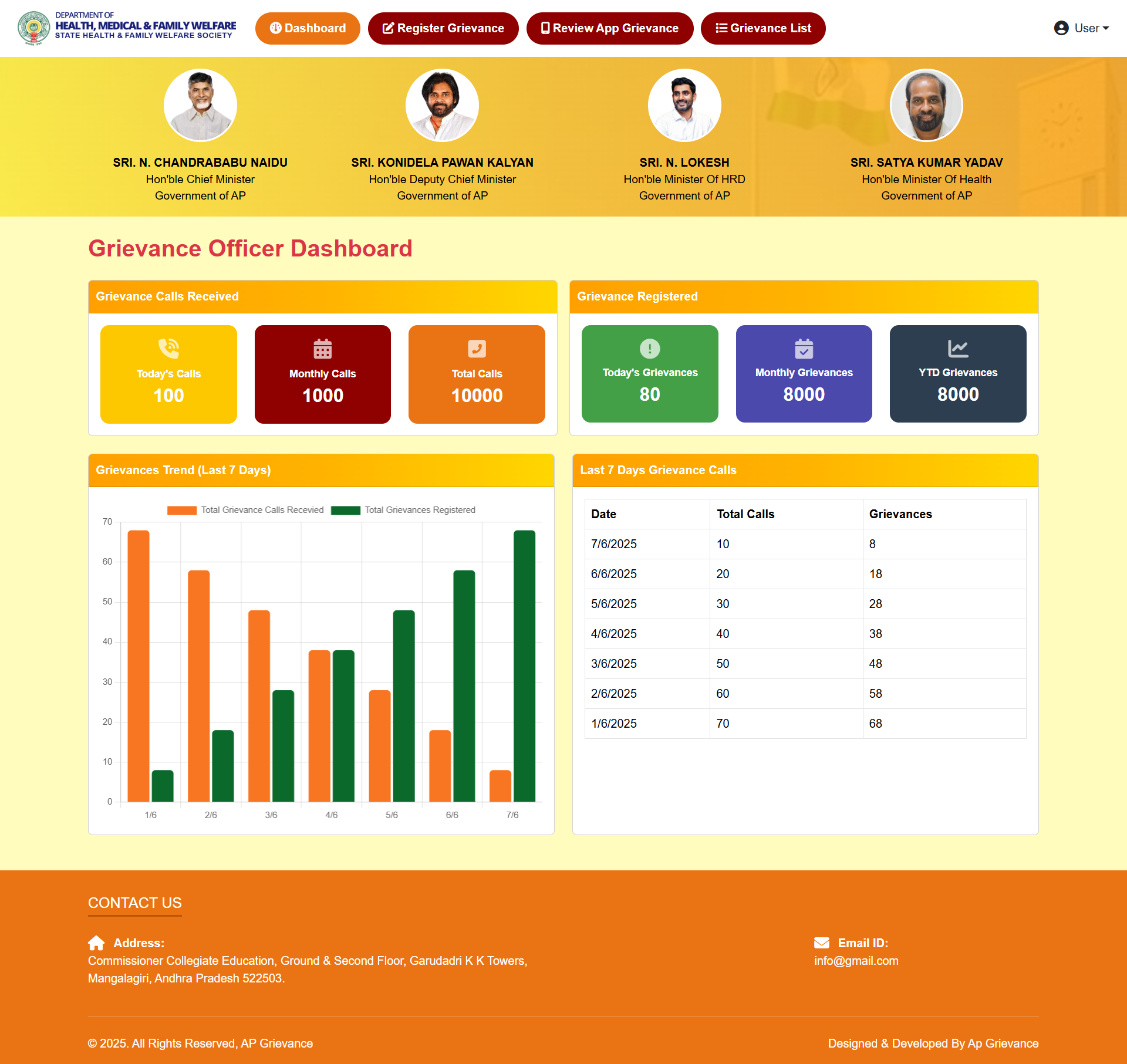
EXECUTIVE IMPACT SUMMARY
The dashboard brought unprecedented transparency and accountability to state governance, drastically improving citizen trust in the 104 helpline.
WORKFLOW SIMPLIFICATION
Transformed a multi-screen, multi-step provisioning process into a guided 3-step wizard with progressive disclosure.
ACCESSIBILITY & OBSERVABILITY
Redesigned status indicators with shape, color, and text — meeting WCAG 2.1 AA and eliminating ambiguity.
SYSTEM SCALE
Contributed storage-specific UI patterns back to the global HPE GreenLake design system.
Senior Practitioner Insights
Designing for legacy hardware (e.g., 1024x768 resolution monitors in rural offices).
Navigating bureaucratic approval processes for UI changes.