BudgetBridge
A smart personal finance app focusing on automated expense tracking, flexible budgeting, and behavioral savings goals.
ROLE
Senior UI/UX Designer
DURATION
5 months
TEAM
2 Designers, 3 Engineers
PLATFORM
iOS & Android App
OWNERSHIP & SCOPE
Behavioral UX Strategy · Onboarding Flow Optimization · Data Visualization Design · Animation & Gamification
DESIGN STACK
THE PROBLEM
Users found existing budgeting apps too rigid. If they overspent in one category, the app would show "Red" failing states, causing guilt and a 70% abandonment rate within the first month.
MY ROLE & CONTRIBUTION
An empathetic, guilt-free budgeting app that adapts to the user's lifestyle.
Removing the guilt associated with budgeting while still providing accurate financial tracking.
TARGET USER
Young Professional — Checks bank balance only when anxious. Responds well to positive reinforcement.
CORE FRICTION
Security concerns regarding Plaid/Bank connections Categorization of transactions is notoriously inaccurate
BUSINESS DRIVER
Most budgeting apps on the market felt like glorified spreadsheets. BudgetBridge aimed to capture the Gen Z / Millennial market by focusing on behavioral psychology rather than rigid accounting.
KEY CONSTRAINTS
Security concerns regarding Plaid/Bank connections
Categorization of transactions is notoriously inaccurate
Designing for financial anxiety
Evidence & Insights
Approach: Diary studies over 2 weeks with 10 target users, plus in-depth emotional interviews. Conducted a competitive audit of YNAB, Mint, and Cleo to understand their approaches to budgeting methodologies (Zero-based vs. Cash-flow).
USER INSIGHT
Users experience extreme guilt when seeing red negative numbers.
DESIGN IMPLICATION
Implement "Flexible Budgets" that auto-rebalance if you overspend in one category.
USER INSIGHT
Most users budget mentally by "what's left to spend" rather than "what I have spent".
DESIGN IMPLICATION
Use Lottie animations to celebrate small wins (e.g., staying under budget for coffee).
USER INSIGHT
Automated categorization is only accurate 70% of the time, causing frustration.
DESIGN IMPLICATION
Streamline onboarding to ask for only 3 primary categories to start.
Core Architecture & Trade-Offs
Every major interface decision was evaluated against real enterprise constraints, user cognitive load, and accessibility standards.
DECISION 01
Swipe right to confirm auto-category, swipe left to recategorize. This turned a chore into a micro-game.
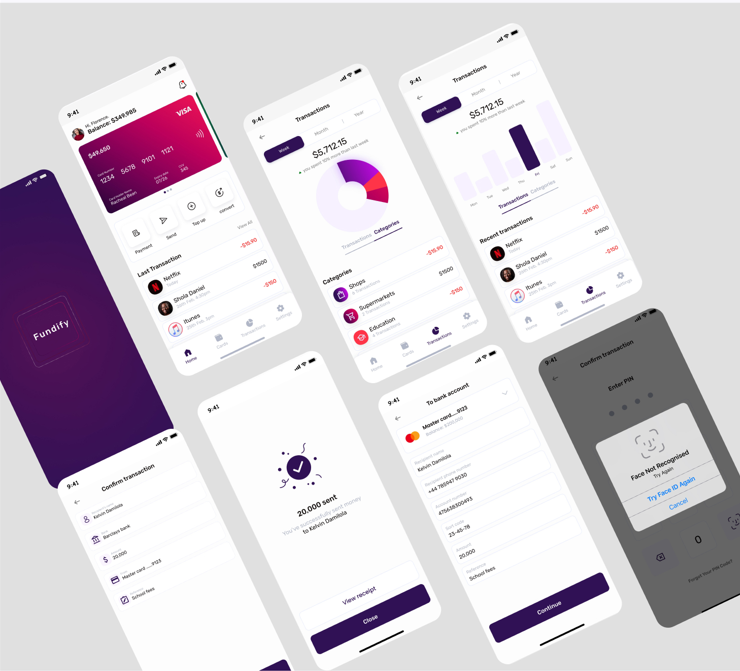
An inviting, modern mobile interface that feels more like a wellness app than a learning app.
EXECUTIVE IMPACT SUMMARY
BudgetBridge successfully gamified personal finance, turning a high-anxiety task into an engaging, guilt-free daily habit.
WORKFLOW SIMPLIFICATION
Transformed a multi-screen, multi-step provisioning process into a guided 3-step wizard with progressive disclosure.
ACCESSIBILITY & OBSERVABILITY
Redesigned status indicators with shape, color, and text — meeting WCAG 2.1 AA and eliminating ambiguity.
SYSTEM SCALE
Contributed storage-specific UI patterns back to the global HPE GreenLake design system.
Senior Practitioner Insights
Designing around the limitations and latency of third-party banking APIs (Plaid).