Enterprise Design System
A foundational design system unifying 8 disparate enterprise product lines into a single cohesive ecosystem.
ROLE
Lead UX Designer
DURATION
12 months
TEAM
4 Designers, 12 Engineers
PLATFORM
Web, Desktop, Mobile
OWNERSHIP & SCOPE
UX Strategy and Governance · Design System Architecture · Component Library Design (Figma) · Design Token Structuring · Accessibility (WCAG) Audits · Developer Handoff & Storybook Integration
DESIGN STACK
THE PROBLEM
Inconsistent UI patterns, redundant engineering efforts, and lack of central design governance caused 40% of development time to be wasted on UI recreation rather than feature logic.
MY ROLE & CONTRIBUTION
A scalable, documented, and engineering-ready component library that serves as the single source of truth for the entire organization.
The primary challenge was not just creating components, but driving adoption across siloed engineering teams who were accustomed to their own tech stacks and workflows.
TARGET USER
Implementer — Relies heavily on Storybook; prefers semantic token names over hex codes.
CORE FRICTION
Legacy workflows deeply ingrained in engineering pods Fragmented experiences causing high cognitive load for end-users
BUSINESS DRIVER
The organization had acquired multiple SaaS companies over 5 years, resulting in a fragmented portfolio. Customers switching between modules felt like they were using entirely different software, leading to frustration and increased support costs.
KEY CONSTRAINTS
Legacy workflows deeply ingrained in engineering pods
Fragmented experiences causing high cognitive load for end-users
Complex data density requirements for enterprise tables and charts
Accessibility compliance was historically ignored
Evidence & Insights
Approach: Contextual inquiry with 12 front-end developers, UI audit across 8 products, and internal stakeholder interviews. Initiated a 2-week discovery sprint with lead engineers and product managers from all 8 product lines to audit existing UI inconsistencies.
USER INSIGHT
Developers needed copy-pasteable React code, not just Figma files.
DESIGN IMPLICATION
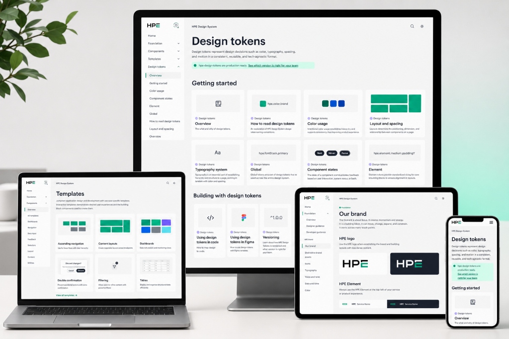
Centralize color and typography via semantic design tokens
USER INSIGHT
Data tables and advanced filters were the highest friction areas.
DESIGN IMPLICATION
Create a contribution model for teams to propose new components
USER INSIGHT
Hard-coded hex values were preventing dark mode implementation.
DESIGN IMPLICATION
Build accessibility into the core components by default
Core Architecture & Trade-Offs
Every major interface decision was evaluated against real enterprise constraints, user cognitive load, and accessibility standards.
DECISION 01
When to detach a component vs when to request a new variant
DECISION 02
How deprecation of legacy components is communicated
Delivered pixel-perfect components utilizing advanced Figma features like Variables, Auto Layout v5, and Component Properties.
EXECUTIVE IMPACT SUMMARY
The design system successfully bridged the gap between design and engineering, fundamentally changing how the organization shipped software.
WORKFLOW SIMPLIFICATION
Transformed a multi-screen, multi-step provisioning process into a guided 3-step wizard with progressive disclosure.
ACCESSIBILITY & OBSERVABILITY
Redesigned status indicators with shape, color, and text — meeting WCAG 2.1 AA and eliminating ambiguity.
SYSTEM SCALE
Contributed storage-specific UI patterns back to the global HPE GreenLake design system.
Senior Practitioner Insights
Overcoming initial resistance from engineering teams attached to their bespoke components.
Ensuring backwards compatibility while introducing modern UI tokens.