Governance, Risk & Compliance Dashboard
An executive dashboard designed to simplify complex risk management, audit tracking, and compliance reporting for Fortune 500 enterprises.
ROLE
Principal Product Designer
DURATION
9 months
TEAM
3 Designers, 8 Engineers, 2 PMs
PLATFORM
Web Application (Desktop Optimized)
OWNERSHIP & SCOPE
Domain Research & Stakeholder Workshops · Information Architecture · Complex Data Visualization Design · Prototyping & Usability Validation · Design QA
DESIGN STACK
THE PROBLEM
Risk officers lacked a unified, real-time view of their compliance posture. Critical alerts were buried in raw data, and audit reporting took weeks to compile manually.
MY ROLE & CONTRIBUTION
A powerful, highly-visual dashboard that bubbles up critical risks and automates compliance workflows.
Designing for extremely high data density while maintaining clarity. The dashboard needed to serve both C-level executives (needing high-level summaries) and compliance analysts (needing deep-dive data tables).
TARGET USER
Executive — Logs in daily for 10 minutes. Relies on visual indicators.
CORE FRICTION
Data overload leading to decision paralysis Multiple user roles with entirely different mental models
BUSINESS DRIVER
Compliance teams were managing risks across global markets using fragmented spreadsheets and legacy software, leading to high error rates and severe regulatory penalties.
KEY CONSTRAINTS
Data overload leading to decision paralysis
Multiple user roles with entirely different mental models
Strict security and data privacy constraints during research
Complex data visualization requirements
Evidence & Insights
Approach: Contextual inquiry (observing analysts at work), in-depth interviews with 8 risk officers, and concept testing. Conducted a 3-day workshop with Chief Risk Officers (CROs) and compliance analysts to map the end-to-end audit lifecycle.
USER INSIGHT
CROs only care about anomalies and trends; analysts care about the raw underlying data.
DESIGN IMPLICATION
Implement a unified "Risk Score" metric.
USER INSIGHT
Heatmaps are the industry standard mental model for risk, but they are often inaccessible to colorblind users.
DESIGN IMPLICATION
Use progressive disclosure to handle data density.
USER INSIGHT
Exporting to PDF/Excel is a mandatory feature, not a nice-to-have.
DESIGN IMPLICATION
Create role-based dashboard views.
Core Architecture & Trade-Offs
Every major interface decision was evaluated against real enterprise constraints, user cognitive load, and accessibility standards.
DECISION 01
Required approval chains based on risk severity
DECISION 02
Handling edge cases where data sources fail to sync
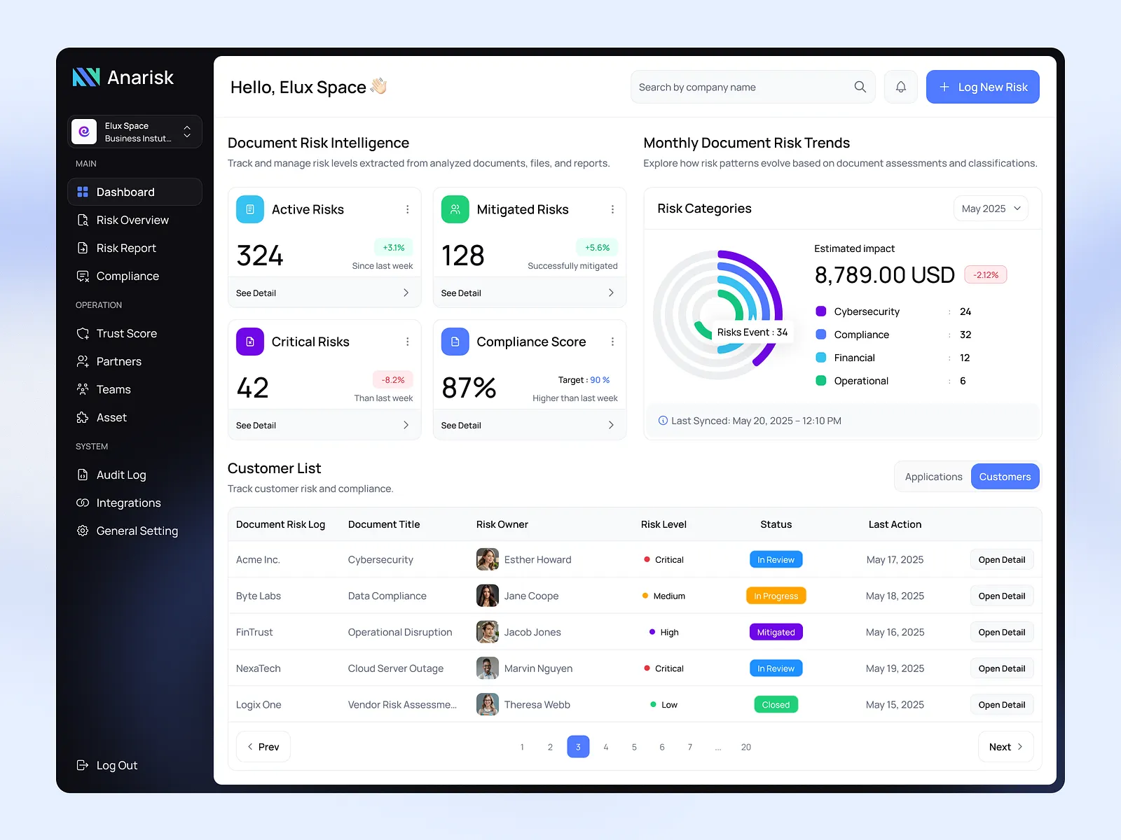
Designed a highly premium, dark-themed dashboard that felt akin to a Bloomberg terminal—professional, data-rich, and lightning fast.
EXECUTIVE IMPACT SUMMARY
The dashboard transformed a chaotic, spreadsheet-driven process into a sleek, centralized command center for enterprise risk.
WORKFLOW SIMPLIFICATION
Transformed a multi-screen, multi-step provisioning process into a guided 3-step wizard with progressive disclosure.
ACCESSIBILITY & OBSERVABILITY
Redesigned status indicators with shape, color, and text — meeting WCAG 2.1 AA and eliminating ambiguity.
SYSTEM SCALE
Contributed storage-specific UI patterns back to the global HPE GreenLake design system.
Senior Practitioner Insights
Balancing the need for detailed data with executive summary views.
Navigating strict enterprise data security constraints during user research.