SaaS Analytics Dashboard
A modern, customizable business intelligence platform for SaaS founders and growth teams to track real-time KPIs.
ROLE
Lead UI/UX Designer
DURATION
6 months
TEAM
2 Designers, 6 Engineers
PLATFORM
Web Application
OWNERSHIP & SCOPE
Product Strategy · UX Research & Conceptualization · Widget & Layout Engine Design · High-Fidelity UI Design · Micro-interaction Design
DESIGN STACK
THE PROBLEM
Existing BI tools were too complex for non-technical users, requiring SQL knowledge to generate basic reports, leading to low adoption across marketing and sales teams.
MY ROLE & CONTRIBUTION
An intuitive, drag-and-drop analytics dashboard with beautiful default visualizations and smart insights.
Translating complex data querying into a simple, visual drag-and-drop interface without losing the power required by power users.
TARGET USER
Decision Maker — Wants high-level overviews with the ability to drill down if a metric looks off.
CORE FRICTION
Steep learning curve in data visualization Customization vs. Consistency (allowing users to edit dashboards without breaking the layout)
BUSINESS DRIVER
The client wanted to disrupt the BI market by offering a tool that was as powerful as Tableau but as easy to use as Google Analytics.
KEY CONSTRAINTS
Steep learning curve in data visualization
Customization vs. Consistency (allowing users to edit dashboards without breaking the layout)
Performance issues rendering large datasets in the browser
Evidence & Insights
Approach: Interviews with 15 SaaS founders, marketers, and product managers. Aligned with the product team on the core "North Star" metrics that SaaS companies care about (MRR, Churn, LTV, CAC).
USER INSIGHT
Users want answers, not charts. (e.g., "Why did churn spike yesterday?")
DESIGN IMPLICATION
Provide pre-built "Templates" for common SaaS metrics.
USER INSIGHT
Sharing data via Slack/Email is just as important as viewing it in the app.
DESIGN IMPLICATION
Implement a smart auto-aligning grid system for the dashboard.
USER INSIGHT
Visual aesthetics matter—founders want dashboards they can screenshot for investors.
DESIGN IMPLICATION
Use natural language processing (NLP) for querying (e.g., "Show me revenue by month").
Core Architecture & Trade-Offs
Every major interface decision was evaluated against real enterprise constraints, user cognitive load, and accessibility standards.
DECISION 01
Separating Data Selection from Visualization Configuration to reduce cognitive load.
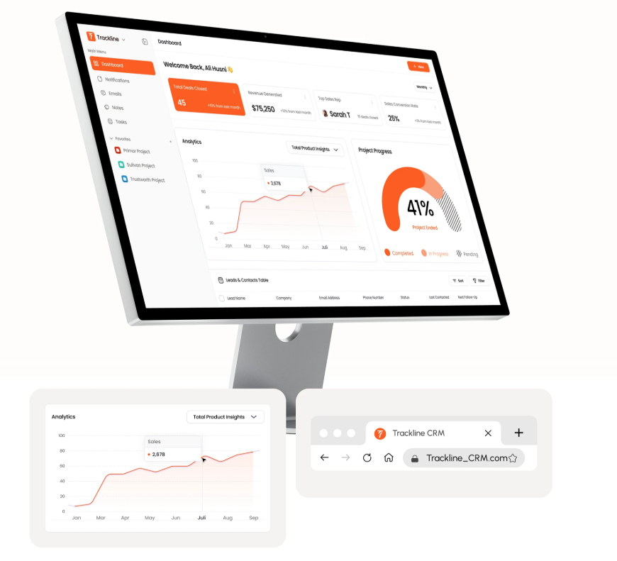
A visually stunning interface that feels premium, fast, and highly responsive. Utilized subtle background blurs and sleek chart animations.
EXECUTIVE IMPACT SUMMARY
The redesigned analytics platform successfully empowered non-technical users to harness their data, becoming the central operating system for their growth teams.
WORKFLOW SIMPLIFICATION
Transformed a multi-screen, multi-step provisioning process into a guided 3-step wizard with progressive disclosure.
ACCESSIBILITY & OBSERVABILITY
Redesigned status indicators with shape, color, and text — meeting WCAG 2.1 AA and eliminating ambiguity.
SYSTEM SCALE
Contributed storage-specific UI patterns back to the global HPE GreenLake design system.
Senior Practitioner Insights
Designing a robust charting library that works in both light and dark modes.
Handling empty states elegantly when data sources are still syncing.