HPE Storage Platform
Redesigning enterprise storage management workflows to help administrators provision, monitor, and troubleshoot infrastructure with less complexity.
ROLE
Lead UI/UX Designer
DURATION
14 months
TEAM
5 Designers, 20+ Engineers
PLATFORM
Web Application
OWNERSHIP & SCOPE
Workflow Analysis & Simplification · Wireframing Complex Technical Flows · Adhering to & Extending the HPE Design System · High-Fidelity UI Design · Collaboration with Global Engineering Teams
DESIGN STACK
THE PROBLEM
IT administrators faced steep learning curves, fragmented workflows for cloud provisioning, and difficult-to-parse performance metrics.
MY ROLE & CONTRIBUTION
I led the UX direction from discovery and workflow analysis through interaction design, visual design, and developer collaboration — owning the end-to-end design process across storage provisioning, monitoring, and topology visualization.
Balancing the deep technical requirements of infrastructure engineers with the need for a simplified, modern user experience.
TARGET USER
IT Pro — Highly technical, prefers CLI but uses GUI for high-level monitoring.
CORE FRICTION
Extremely complex domain knowledge required to understand user tasks Strict adherence to the overarching HPE design system while inventing new patterns for storage
BUSINESS DRIVER
HPE needed to modernize its legacy infrastructure management tools to compete with cloud-native offerings from AWS and Azure.
KEY CONSTRAINTS
Extremely complex domain knowledge required to understand user tasks
Strict adherence to the overarching HPE design system while inventing new patterns for storage
Visualizing petabytes of data usage intuitively
Evidence & Insights
Approach: Remote contextual inquiry and task analysis with enterprise IT administrators. Embedded with the storage engineering team to understand the technical constraints of SAN, NAS, and Object storage provisioning.
USER INSIGHT
Admins rely heavily on topology maps to understand physical vs. logical storage.
DESIGN IMPLICATION
Implement a wizard-based approach for complex provisioning tasks.
USER INSIGHT
Error messages in the legacy system were unhelpful (e.g., "Error 504") rather than actionable.
DESIGN IMPLICATION
Standardize terminology across the hybrid cloud portfolio.
USER INSIGHT
Capacity planning is a major anxiety point for admins.
DESIGN IMPLICATION
Use machine learning insights to predict storage capacity exhaustion.
Core Architecture & Trade-Offs
Every major interface decision was evaluated against real enterprise constraints, user cognitive load, and accessibility standards.
Guided Wizard Over Open-Form Provisioning
THE PROBLEM
Provisioning a storage volume required navigating 4 separate screens, each demanding context switches between different data types. New administrators made frequent configuration errors; experienced admins found the process time-consuming.
WHAT WAS EXPLORED
A single-page form with all fields visible, a tabbed multi-section layout, and a multi-step guided wizard with progressive disclosure.
WHAT WAS CHOSEN
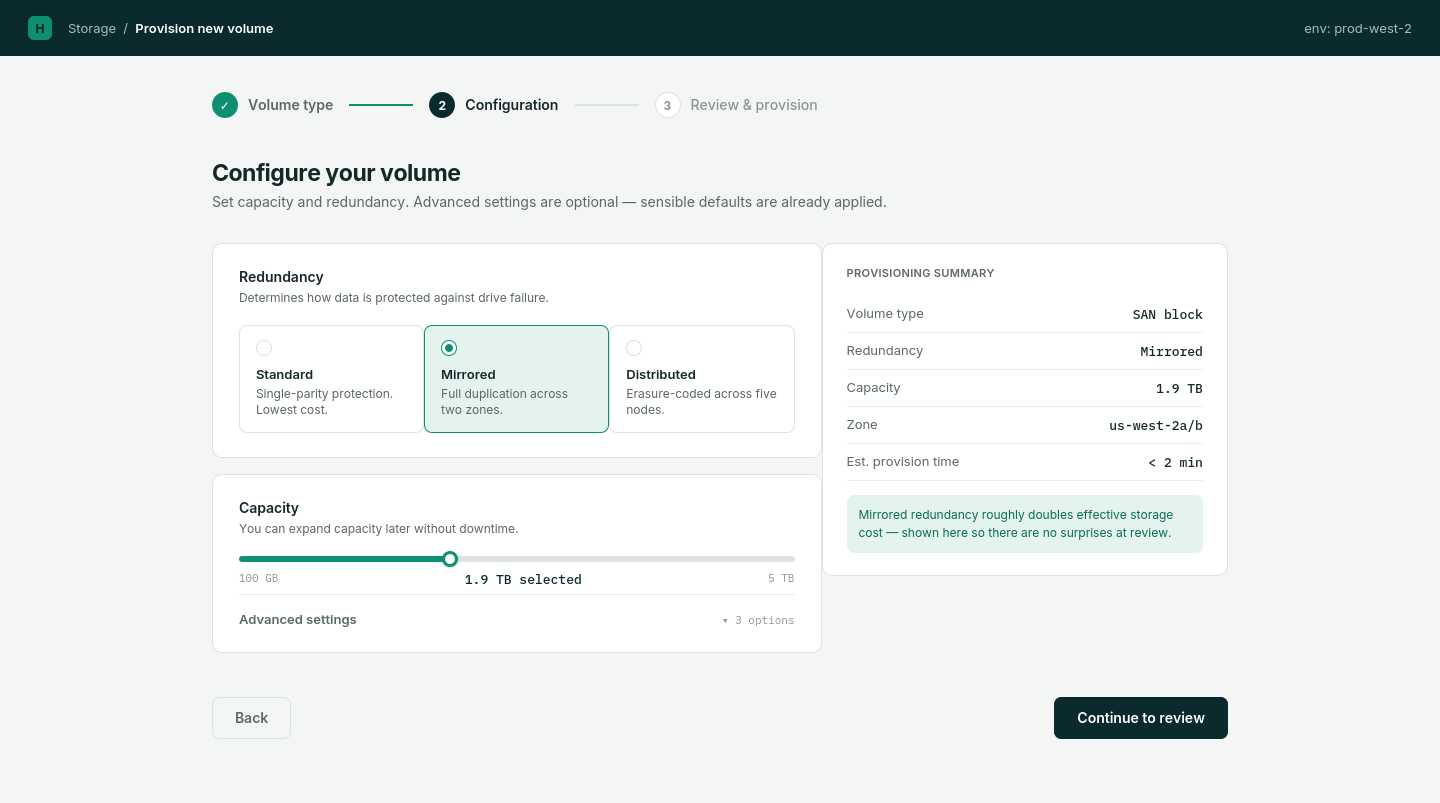
A 3-step wizard surfacing only the most critical fields upfront — storage type, capacity, and access settings — with advanced options (RAID levels, tiering policies) behind a collapsible Advanced Settings section.
WHY
Most provisioning tasks follow a standard pattern. Hiding advanced configuration reduces cognitive load for common cases while preserving depth for specialist scenarios. The wizard also enforces a logical sequence, reducing out-of-order errors.
WHAT CHANGED
Provisioning transformed from a multi-screen, error-prone process into a focused, guided flow — making complex configuration accessible without removing flexibility for power users.
Multi-Modal Status Indicators
THE PROBLEM
The legacy system communicated system health using color alone — red for critical, amber for warning, green for healthy. This failed accessibility standards, was insufficient in dense topology views, and could be missed under high workload.
WHAT WAS EXPLORED
Color-only indicators (status quo), text-only labels, icon-based indicators alone, and combined shape-plus-color-plus-text indicators.
WHAT WAS CHOSEN
Multi-modal indicators combining a distinct shape, a semantic color, and a short text label — ensuring status is unambiguous regardless of context or visual impairment.
WHY
WCAG 2.1 AA requires that information is not conveyed by color alone. In infrastructure management, a missed critical alert has real operational consequences. Shapes remain distinguishable even at small sizes in dense views.
WHAT CHANGED
Status became reliably readable across the topology view, alert lists, and detail panels — meeting accessibility requirements without compromising information density.
Topology as Primary Navigation Surface
THE PROBLEM
The physical-to-logical storage relationship is the administrator's primary mental model, but the legacy tool buried the topology view behind multiple navigation levels.
WHAT WAS EXPLORED
List-based inventory views, tabular data grids, and a visual topology map as the primary overview surface.
WHAT WAS CHOSEN
The topology map as the default landing view, with contextual drill-down from within the map — actions and status visible at the node level without leaving topology context.
WHY
Storage administrators think spatially about their infrastructure. Aligning the information architecture with the administrator's mental model reduces orientation time and makes the impact of changes immediately visible.
WHAT CHANGED
Administrators could understand system health, identify failing components, and initiate actions without switching context — reducing the cognitive overhead of infrastructure monitoring.
A deeply technical yet visually refined interface that instills confidence in the user.
ANNOTATED INTERFACE HIGHLIGHTS
Guided 3-Step Provisioning Wizard
Replaced 15 fragmented fields across 4 screens with a 3-step wizard. Surfaced core parameters upfront while placing RAID and tiering policies inside collapsibles.
Multi-Modal Status Indicators
Redesigned health status indicators using shape, color, and text labels — satisfying WCAG 2.1 AA and eliminating ambiguity in high-density views.
Interactive Hardware Topology Map
Mapped physical server nodes to logical storage pools in a single view, allowing admins to inspect hardware health without losing spatial context.
Contextual Action Drawer
Enabled inline volume configuration and diagnostic actions directly from node selection, eliminating multi-screen context switching.
EXECUTIVE IMPACT SUMMARY
The redesigned HPE Storage Platform aligned enterprise storage management with the HPE GreenLake brand, improving the coherence of the admin experience across provisioning, monitoring, and topology workflows.
WORKFLOW SIMPLIFICATION
Transformed a multi-screen, multi-step provisioning process into a guided 3-step wizard with progressive disclosure.
ACCESSIBILITY & OBSERVABILITY
Redesigned status indicators with shape, color, and text — meeting WCAG 2.1 AA and eliminating ambiguity.
SYSTEM SCALE
Contributed storage-specific UI patterns back to the global HPE GreenLake design system.
Senior Practitioner Insights
Enterprise UX is not about reducing information — it is about helping users prioritize it. Storage administrators work with dense, critical data. The challenge was not simplification; it was creating the right hierarchy so the most important signals surface first.
Deep domain literacy is a prerequisite for effective enterprise design. I could not design useful error states or topology visualizations without genuinely understanding how SAN, NAS, and Object storage provisioning works. Embedding with the engineering team early made the difference.
Consistency becomes a usability feature in complex enterprise products. When an admin operates across multiple HPE storage product lines, inconsistent terminology and interaction patterns create cognitive overhead. Standardizing these was not just an aesthetic decision.